Stakeholder Mapping

Author:  Jinelle Piereder, Doctoral Fellow, Cascade Institute

Skip to the map

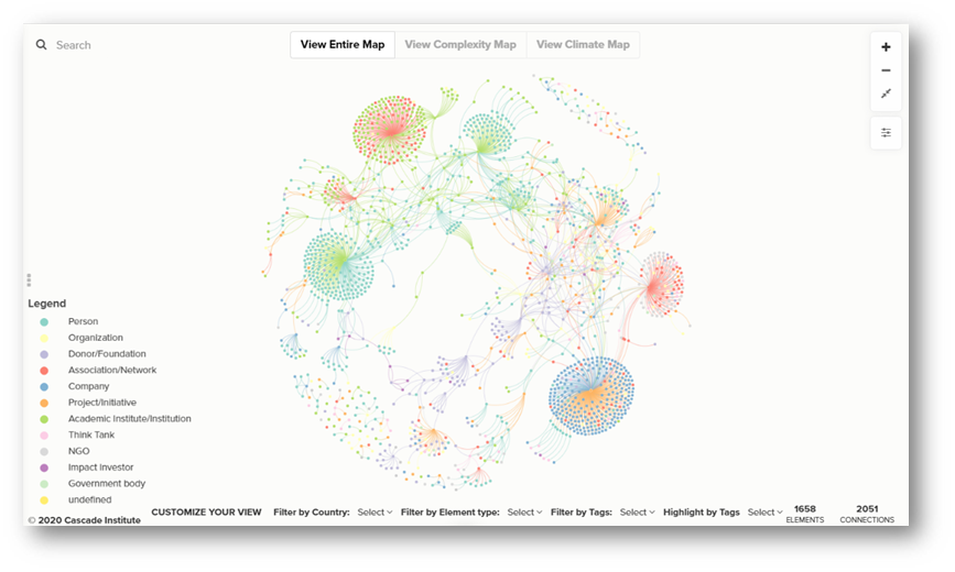
The Cascade Institute uses stakeholder and social network mapping tools to better understand our strategic environment, to identify and engage with key stakeholders, and to better assess our impact. Here, we present a visualization of an ongoing mapping exercise of people and organizations engaged in work on complex systems, climate change and energy transition, green/just recovery, and other fields relevant to CI. We include actors from across academic, philanthropic, civil society, government, and private sectors. Our database is built in Airtable and visualized using a systems mapping tool called Kumu, and functions essentially as a digital network rolodex. The map will continue to evolve as we regularly learn about new efforts and build new relationships.

Our goal in creating this map is not only to provide a useful resource, but also to ensure we seek out the best partnerships and collaborations, are not duplicating the efforts of other organizations, and are working to advance the Cascade Institute’s mandate around fair and sustainable prosperity.

This mapping exercise is ongoing and in no way represents a full picture of any of the sectors or fields represented. If you’d like to submit a new organization, project, or researcher to the map or if you notice an error, please send us an email at [email protected]

  • Investigate relationships between people/organizations
  • Identify key influencers and important hubs
  • Find pathways of connection from one element to another
  • Search for organizations to link to or partner with
  • Search for possible speakers/experts
  • Identify interviewees
  • Find universities with complex-systems-related programs
  • Search for potential academic advisors
  • Identify relevant foundations and donors

What is Airtable?
Airtable is a powerful combination of a spreadsheet and a relational database. We use Airtable to gather and organize information about the evolving complex systems research landscape. Learn more

What is Kumu?
Kumu is a systems mapping and visualization platform with highly customizable views and ways to explore the data. By combining these tools, we gain all the rich detail possible in a relational database, as well as the compelling visualizations and network analysis insights from a systems/network mapping tool. For more details about Kumu’s architecture, click here or watch this video.

  • The map is made up of elements (the dots, known in network science as nodes) and connections (the lines, known in network science as links). In this map, the elements are entities (a person, organization, initiative, etc.) and are shown in the colour-coded legend. The connections represent the relationships between these entities (with link types such as employee/employer, advisor or board member, member, etc.).
  • Plus Minus ButtonsZoom in and out by using your mouse’s roller ball or by clicking the plus and minus icons at the top-right of the map. Click the two arrows pointing to each other to fit the whole map in the frame. You can also grab and move the map background with your mouse to reposition your view.
  • Hover over any element to see a popup summary of its profile. Hover over any connection to see its type.
  • Read an element’s whole profile by selecting it in the map. Toggle the side panel on the left by clicking the 3 little grey dots. In the profile, you’ll see the element’s label, type (which is colour-coded and shown in the map legend), an image/logo, a description, tags, website, city/state, and country. Note that not every element has every field filled in yet (this is an ongoing project!).
  • You can select multiple elements or connections by holding down the “shift” key.
  • Search: You can search for specific people, organizations, etc. in the search bar at the top-left of the map.
  • Toggle Views: Switch between several pre-set views (subsets) of the map using the buttons at the top of the map. If you want to further refine or customize your own view, use the dropdown filters at the bottom of the map.
  • Filter by Country: View a subset of elements based on Country by selecting one or more Countries in the first dropdown menu at the bottom of the map. Click the Country name again to de-select it.
  • Filter by Element Type: View only certain element types using the second dropdown menu. You can select one or more types, and everything else will be temporarily hidden. Click the Types again to de-select them.
  • Filter by Tags: View a subset of elements with only certain tags (and hide the rest) by selecting one or more Tags in the third dropdown menu. Click the Tags again to de-select them.
  • Highlight by Tags: Highlight elements with only certain tags (and fade everything else into the background) by selecting one or more Tags in the last dropdown menu. Click the Tags again to de-select them.
  • Focus: When you have one or more elements selected, the “focus” button will appear at the top-right of the map underneath the zoom buttons. Click it to filter away (hide) all the other map data. Use the up and down arrows to increase or decrease the number of connections away from your focus. The number of elements and connections in your current focus is displayed at the bottom of the map.

Is your organization missing from the map? Submit your organization here.